Nicolas Knight
Dashboard
Website Redesign
Portland Art Museum
Summary
Portland Art Museum came to us with an outdated website and two chunky design challenges.
- The museum’s membership base has been gradually declining due to the aging demographic of its long-time patrons. They wanted a new modern site that spoke to Portland’s younger, liberal population (and not just elders and art majors).
- NW Film Center (renamed to Center for Untold Tomorrow - PAM CUT), a neighboring non-profit was in the process of merging with PAM. They are all about pushing the boundaries of film-making and immersive digital experiences (think symbiosis), and had very different vibe than a fine arts museum. How could these two co-exist on the same website?
Project: PAM CUT
Client: Portland Art Museum
Platform: WordPress
Role: UX Lead
Activities:
- Discovery workshops
- Research
- Content design
- IA
- Prototyping
High stakes discovery
PAM only paid for the research and discovery phase, and based on the outcomes would decide whether to continue with design and development. No pressure 😅
Many voices
The museum had many departments and stakeholders whose lives would be affected by the new site. We made sure to hear them all out.
Content design
I worked with tandem with a content designer to evolve PAM’s voice from institutional and stuffy to inclusive and friendly. This was a fun process.
Discovery Phase
Workshops
As with any project, we began with a goal alignment workshop to get our North Stars, success metrics, and get to know the client’s team.
We’ve involved folks closely working with the museum goers (admissions, membership, curators) to do an audience core strategy statement workshop, it’s a Mad Lib style exercise that (along with some deck research) gave us a fundamental understanding of the user archetypes and their goals.
Listening tour
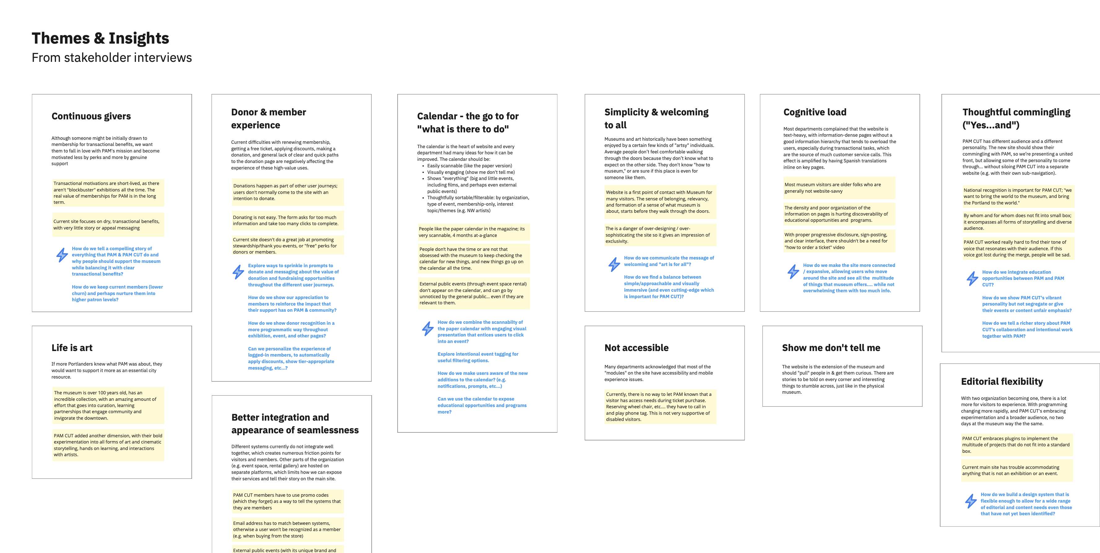
The museum had many departments and stakeholders whose lives would be affected by the new site. We wanted to give space for all of them to be heard and to capture their pain-points and aspirations. We’ve ran 4 group interviews and then synthesized our findings into themes and design program statements. When we presented this, the client told us that “we really feel heard,” which told us we were on the right track.
User and Desk Research
We ran a web survey to understand how general users currently use the website and also used it to recruit folks for 1:1 interviews, to explore how visitors can be nurtured into becoming members and to better keep current members. The interviews were not scoped, but we managed to squeeze them in and add some real user voices into our process.
Desk research included peer landscape analysis, heatmaps, and analytics analysis. While I’ll take qualitative research over quantitative any day, I’m a firm believer at viewing a problem space from as many different angles as possible.
The final discovery deck
The culmination of the discovery phase was a beefy deck which we presented to the powers that and with which won us the full project.
IA & Content Design
The watchword of the IA work was consolidation, simplification (offloading navigation complexity to the pages), and word-smithing replace museum lingo and institutional/academic voice to something friendlier and inclusive of larger population.
💡 Storytelling Insight
From our research, we’ve learned that many memberships are created during big “block-buster” exhibits, but these are far and few in-between. The transactional perks cannot be the reliable driver for memberships. It had to be about genuine support.
Our strategy was to unfold PAM’s bigger role in the Portland community as the user moved through the website, revealing bite-sized storytelling elements about museum’s impact.
The art of the footer
Maybe not the best footer that I’ve made, but definitely up there in top 5, merging utility and comprehensiveness.
Attention to detail: Current day is highlighted in the open hours table.
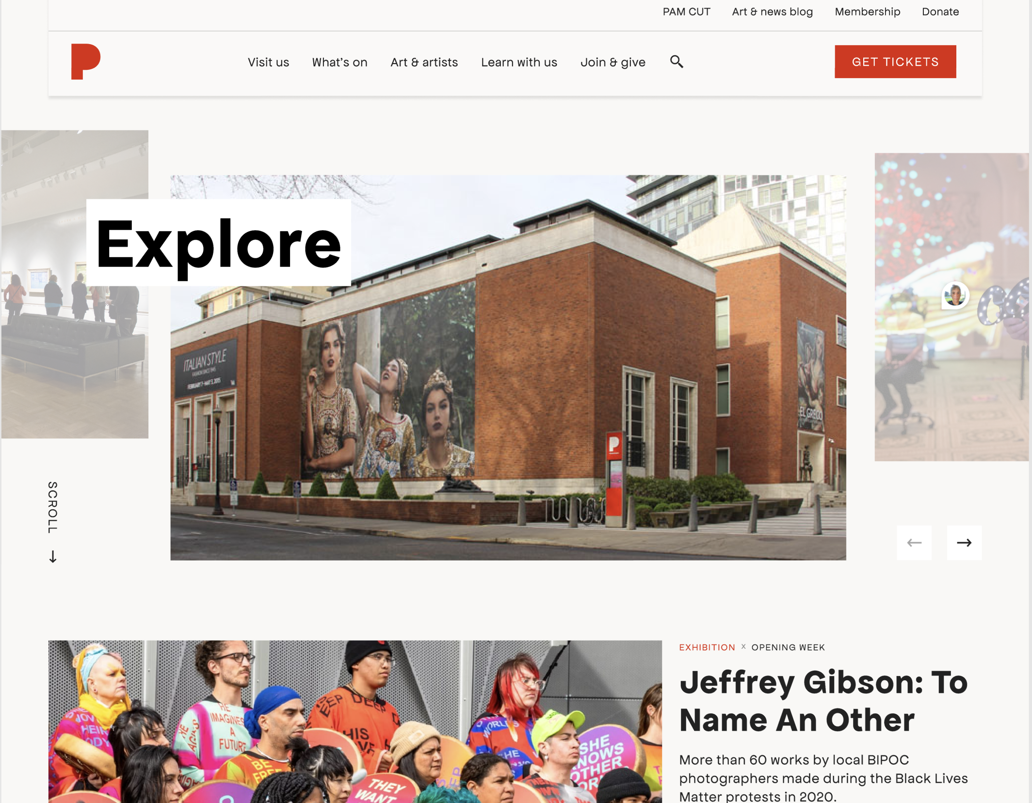
Screens
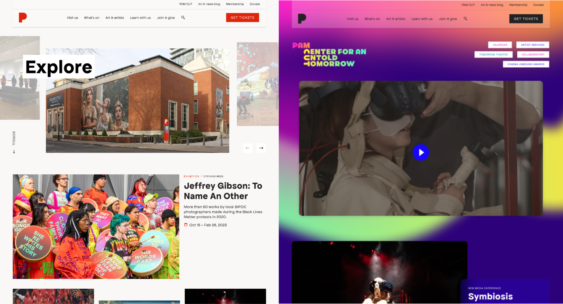
Thoughtful commingling
PAM CUT has different audience and a different personality. The new site should show their commingling with PAM, so we’re presenting a united front, but allowing some of the personality to come through… without siloing PAM CUT into a separate website (e.g. with their own sub-navigation).
The solution was to give PAM CUT their own landing page that reflected their vibrant spirit of exploration and create a “fun” theme into WordPress blocks that can be easily turned on by the editors, on a block and page-level. Kudos Laura Martinez.
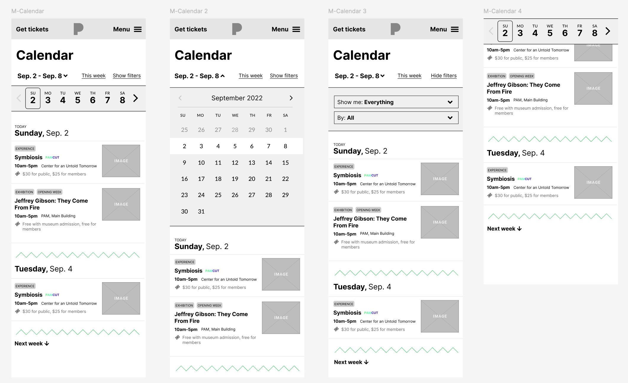
100% prototype
For this project I decided to prototype the entire website from the get-go, keeping focus on wholistic flow rather than individual screens. It worked out well, and the client appreciated the ease of navigating the wireframes.
Nicolas Knight
Dashboard
Website Redesign
Portland Art Museum
Summary
Portland Art Museum came to us with an outdated website and two chunky design challenges.
- The museum’s membership base has been gradually declining due to the aging demographic of its long-time patrons. They wanted a new modern site that spoke to Portland’s younger, liberal population (and not just elders and art majors).
- NW Film Center (renamed to Center for Untold Tomorrow - PAM CUT), a neighboring non-profit was in the process of merging with PAM. They are all about pushing the boundaries of film-making and immersive digital experiences (think symbiosis), and had very different vibe than a fine arts museum. How could these two co-exist on the same website?
Project: PAM CUT
Client: Portland Art Museum
Platform: WordPress
Role: UX Lead
Activities:
- Discovery workshops
- Research
- Content design
- IA
- Prototyping
High stakes discovery
PAM only paid for the research and discovery phase, and based on the outcomes would decide whether to continue with design and development. No pressure 😅
Many voices
The museum had many departments and stakeholders whose lives would be affected by the new site. We made sure to hear them all out.
Content design
I worked with tandem with a content designer to evolve PAM’s voice from institutional and stuffy to inclusive and friendly. This was a fun process.
Discovery Phase
Workshops
As with any project, we began with a goal alignment workshop to get our North Stars, success metrics, and get to know the client’s team.
We’ve involved folks closely working with the museum goers (admissions, membership, curators) to do an audience core strategy statement workshop, it’s a Mad Lib style exercise that (along with some deck research) gave us a fundamental understanding of the user archetypes and their goals.
Listening tour
The museum had many departments and stakeholders whose lives would be affected by the new site. We wanted to give space for all of them to be heard and to capture their pain-points and aspirations. We’ve ran 4 group interviews and then synthesized our findings into themes and design program statements. When we presented this, the client told us that “we really feel heard,” which told us we were on the right track.
User and Desk Research
We ran a web survey to understand how general users currently use the website and also used it to recruit folks for 1:1 interviews, to explore how visitors can be nurtured into becoming members and to better keep current members. The interviews were not scoped, but we managed to squeeze them in and add some real user voices into our process.
Desk research included peer landscape analysis, heatmaps, and analytics analysis. While I’ll take qualitative research over quantitative any day, I’m a firm believer at viewing a problem space from as many different angles as possible.
The final discovery deck
The culmination of the discovery phase was a beefy deck which we presented to the powers that and with which won us the full project.
IA & Content Design
The watchword of the IA work was consolidation, simplification (offloading navigation complexity to the pages), and word-smithing replace museum lingo and institutional/academic voice to something friendlier and inclusive of larger population.
💡 Storytelling Insight
From our research, we’ve learned that many memberships are created during big “block-buster” exhibits, but these are far and few in-between. The transactional perks cannot be the reliable driver for memberships. It had to be about genuine support.
Our strategy was to unfold PAM’s bigger role in the Portland community as the user moved through the website, revealing bite-sized storytelling elements about museum’s impact.
The art of the footer
Maybe not the best footer that I’ve made, but definitely up there in top 5, merging utility and comprehensiveness.
Attention to detail: Current day is highlighted in the open hours table.
Screens
Thoughtful commingling
PAM CUT has different audience and a different personality. The new site should show their commingling with PAM, so we’re presenting a united front, but allowing some of the personality to come through… without siloing PAM CUT into a separate website (e.g. with their own sub-navigation).
The solution was to give PAM CUT their own landing page that reflected their vibrant spirit of exploration and create a “fun” theme into WordPress blocks that can be easily turned on by the editors, on a block and page-level. Kudos Laura Martinez.
100% prototype
For this project I decided to prototype the entire website from the get-go, keeping focus on wholistic flow rather than individual screens. It worked out well, and the client appreciated the ease of navigating the wireframes.