Nicolas Knight
Dashboard
App
MyDMV Dashboard
Summary
No one likes going to the DMV—the waiting, the paperwork, the “what form do I need for that?” Wouldn’t it be nice if you could do everything easily from home via one sleek dashboard? Now you can! (If you live in California.)
California DMV asked us to design and build MyDMV, a digital portal that transforms how Californians manage vehicle and driver-related services—from renewals to upgrades to paperwork—all through a unified, intuitive dashboard.
Project: MyDMV
Client: California DMV
Tech: React
Role: UX Lead
Activities:
- Scope Planning
- Flows
- Documentation
- Interaction Design
- Prototyping
Stakeholder management
Its always a challenge to work with government clients. A PM who’s versed in public sector culture and can navigate complex organizational dynamics is an absolute must.
Documentation spelunking
Mapping out the user flows required deep investigation into a web of complex conditional logic that governed the availability and behavior of various DMV services.
No edge cases
With 27.6 million drivers in the state of California there were no such things as edge-cases.
Scope & Top Tasks
Stories
We compiled a list of stories from the existing site, stakeholder conversations, and future-forward wishlists. These broke out into three categories: 1) Driver Incense/ID related, vehicle related, and 3) account/administrative related.
To prioritize the stories and pull out the top tasks, we looked at the analytics of the forms submitted and transactions made by the drivers in the last year (both from the physical DMV locations and a few digital forms that were available online at that time), and used the numbers to rank each story.
Framing & approach
DMV offers a suite of services (apps) that were essentially glorified online forms. Many of these apps didn’t talk to each other and didn’t share a central database. This meant that users has to fill out every form from scratch (yikes 😬).
Government moves slow, and unfortunately, these disconnected apps had to remain for some time, which complicated many aspects of the MyDMV dashboard, reduced automation, and required temporary duck-tape hacks to achieve some level of convenience for the user.
We helped DMV team frame and visualize this with diagrams and (many) convrsations.
💡 No edge cases
With 27.6 million drivers in the state of California, I evangelized the notion that there are no edge cases, since even if 1% encounter an “edge-case,” thats 276,000 users! That’s no edge-case, that’s the population of a city. Paraphrasing my favorite composer: every blade of grass needed to have the status of a flower.
Flows & Documentation
Conditionality untangling
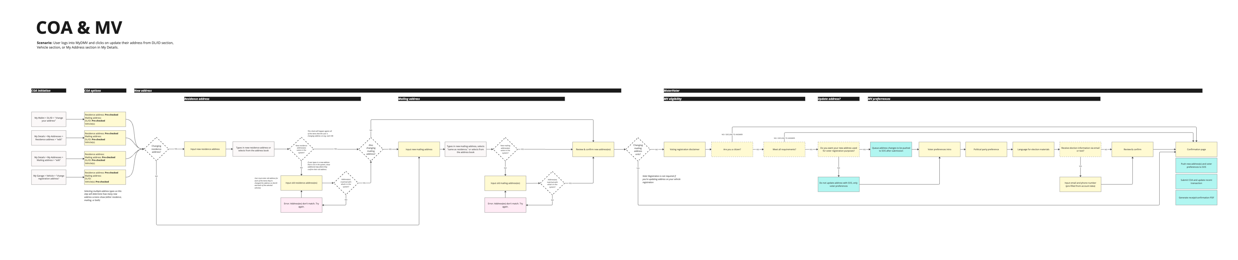
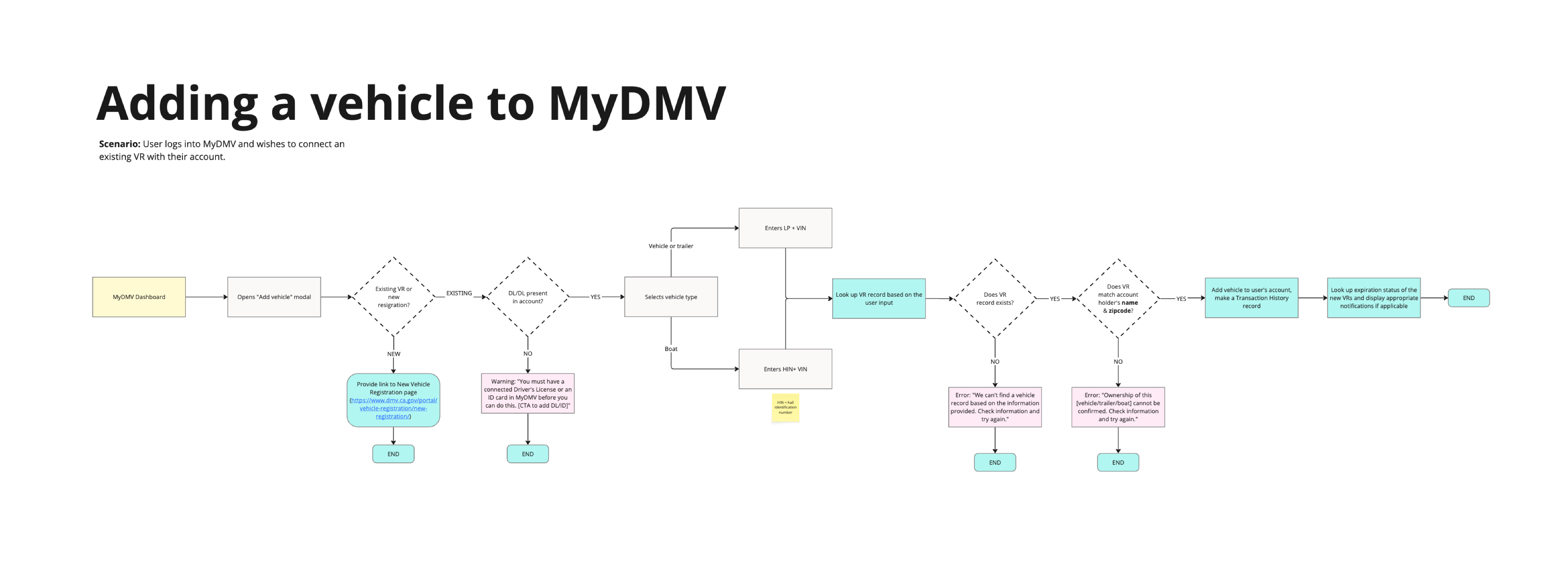
Mapping out the user flows required deep investigation into a web of complex conditional logic that governed the availability and behavior of various services. Each UI state was highly dependent on user-specific data (such as license status, vehicle registration history, and eligibility for renewal) which meant that seemingly simple actions often triggered layered decision trees behind the scenes.
To ensure accuracy, I collaborated closely with stakeholders and combed through fragmented documentation, policy guidelines, and backend workflows to surface and clarify the underlying business rules. I then translated these findings into annotated flow diagrams that became critical alignment tools for both design and development teams.
Screens
General approach
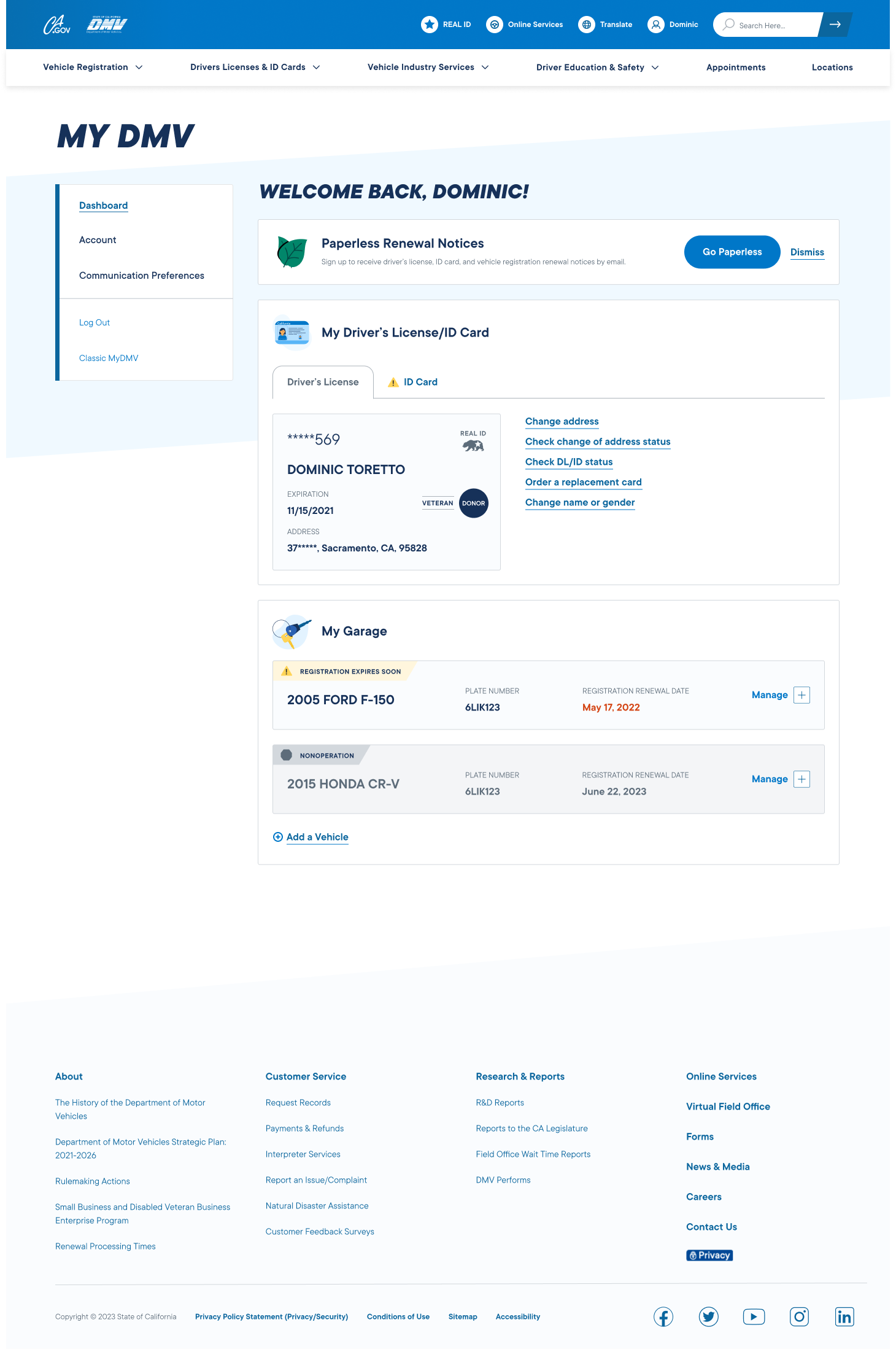
After settling on a screen information hierarchy, I dove into design leveraging DMV’s website design system. Working in tandem with a visual designer, we reused as many of the existing components and styles as possible and only proposed custom components when even the basic version of the idea could not be accomplished using existing assets.
This approach wasn’t ideal, as some of the DMV web components weren’t best suited for an app (e.g., the clunky side navigation), butthis was mandated for the sake of efficiency.
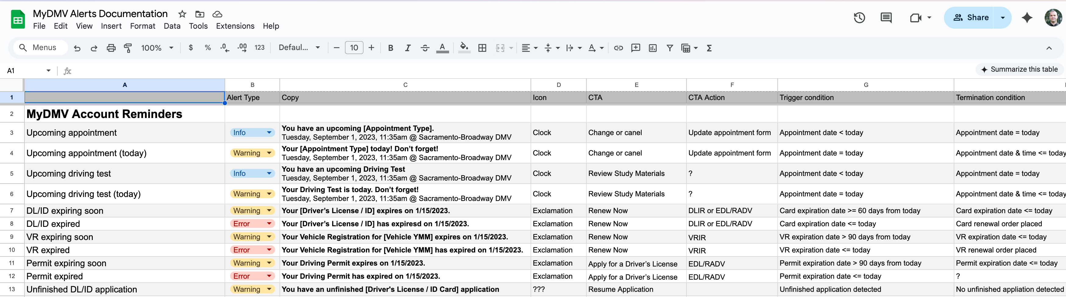
Component states
Using the documented flows as a foundation, I designed modular UI components that could adapt to the various states and conditions defined by the business logic.
💡 Anticipating expectations
DMV processes can be unintuitive. For example, when you submit change of address form, you would expect that you’ll receive a new driver’s license card with the updated address in your mail. But no, you don’t. You need to submit another form.... but only after your change of address request goes through in 3 days.
As an easy stopgap, we pushed to add helpful notes through the app anticipating these nuances that broke users’ expectations.
Sample Screens
Nicolas Knight
Dashboard
App
MyDMV Dashboard
Summary
No one likes going to the DMV—the waiting, the paperwork, the “what form do I need for that?” Wouldn’t it be nice if you could do everything easily from home via one sleek dashboard? Now you can! (If you live in California.)
California DMV asked us to design and build MyDMV, a digital portal that transforms how Californians manage vehicle and driver-related services—from renewals to upgrades to paperwork—all through a unified, intuitive dashboard.
Project: MyDMV
Client: California DMV
Tech: React
Role: UX Lead
Activities:
- Scope Planning
- Flows
- Documentation
- Interaction Design
- Prototyping
Stakeholder management
Its always a challenge to work with government clients. A PM who’s versed in public sector culture and can navigate complex organizational dynamics is an absolute must.
Documentation spelunking
Mapping out the user flows required deep investigation into a web of complex conditional logic that governed the availability and behavior of various DMV services.
No edge cases
With 27.6 million drivers in the state of California there were no such things as edge-cases.
Scope & Top Tasks
Stories
We compiled a list of stories from the existing site, stakeholder conversations, and future-forward wishlists. These broke out into three categories: 1) Driver Incense/ID related, vehicle related, and 3) account/administrative related.
To prioritize the stories and pull out the top tasks, we looked at the analytics of the forms submitted and transactions made by the drivers in the last year (both from the physical DMV locations and a few digital forms that were available online at that time), and used the numbers to rank each story.
Framing & approach
DMV offers a suite of services (apps) that were essentially glorified online forms. Many of these apps didn’t talk to each other and didn’t share a central database. This meant that users has to fill out every form from scratch (yikes 😬).
Government moves slow, and unfortunately, these disconnected apps had to remain for some time, which complicated many aspects of the MyDMV dashboard, reduced automation, and required temporary duck-tape hacks to achieve some level of convenience for the user.
We helped DMV team frame and visualize this with diagrams and (many) convrsations.
💡 No edge cases
With 27.6 million drivers in the state of California, I evangelized the notion that there are no edge cases, since even if 1% encounter an “edge-case,” thats 276,000 users! That’s no edge-case, that’s the population of a city. Paraphrasing my favorite composer: every blade of grass needed to have the status of a flower.
Flows & Documentation
Conditionality untangling
Mapping out the user flows required deep investigation into a web of complex conditional logic that governed the availability and behavior of various services. Each UI state was highly dependent on user-specific data (such as license status, vehicle registration history, and eligibility for renewal) which meant that seemingly simple actions often triggered layered decision trees behind the scenes.
To ensure accuracy, I collaborated closely with stakeholders and combed through fragmented documentation, policy guidelines, and backend workflows to surface and clarify the underlying business rules. I then translated these findings into annotated flow diagrams that became critical alignment tools for both design and development teams.
Screens
General approach
After settling on a screen information hierarchy, I dove into design leveraging DMV’s website design system. Working in tandem with a visual designer, we reused as many of the existing components and styles as possible and only proposed custom components when even the basic version of the idea could not be accomplished using existing assets.
This approach wasn’t ideal, as some of the DMV web components weren’t best suited for an app (e.g., the clunky side navigation), butthis was mandated for the sake of efficiency.
Component states
Using the documented flows as a foundation, I designed modular UI components that could adapt to the various states and conditions defined by the business logic.
💡 Anticipating expectations
DMV processes can be unintuitive. For example, when you submit change of address form, you would expect that you’ll receive a new driver’s license card with the updated address in your mail. But no, you don’t. You need to submit another form.... but only after your change of address request goes through in 3 days.
As an easy stopgap, we pushed to add helpful notes through the app anticipating these nuances that broke users’ expectations.