Nicolas Knight
Dashboard
Web Redesign + Scheduler
Mindpath Health
Summary
Mindpath Health, a leader in mental health services, hired us to transform the patient online experience through a reimagined provider finding and scheduling experience. I ran onsite workshops and broad listening sessions, worked with tight technical constraints to map out complex logic flows, created design principles as synthesis, and executed meticulous user tests on wireframe prototypes to early validations to get client buy-in.
Client: Mindpath Health
Role: UX Lead
Activities:
- Discovery workshops
- Customer journey mapping
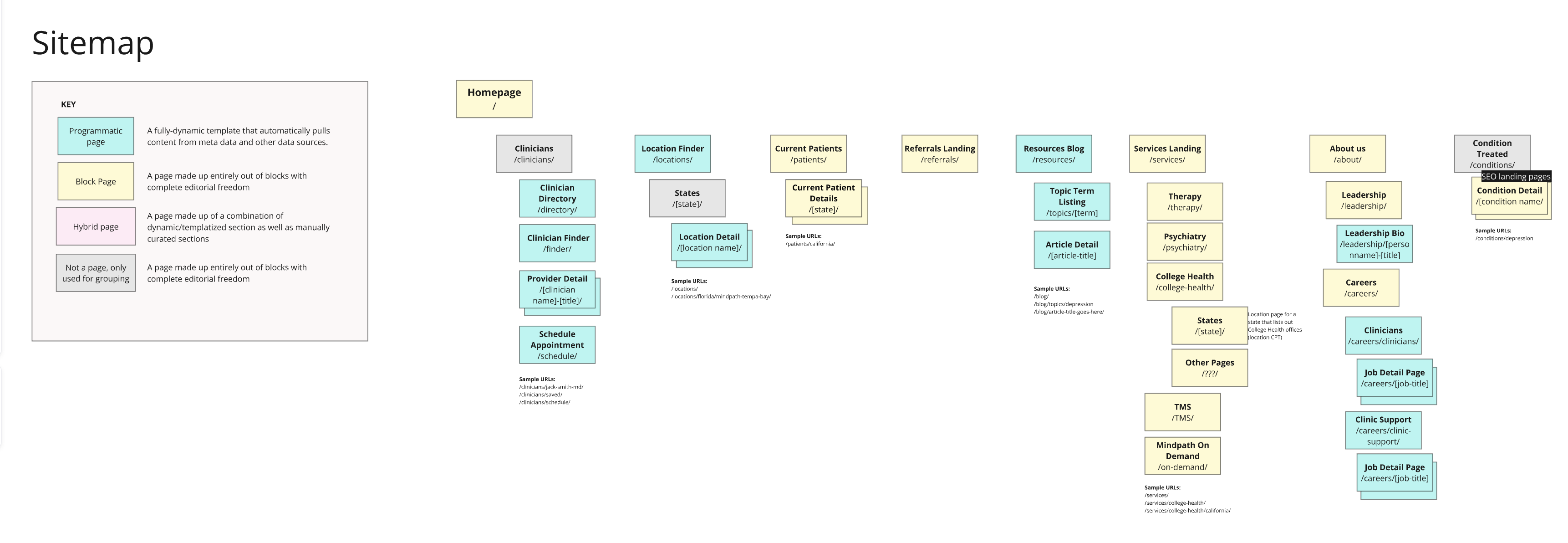
- Information architecture
- Logic flows
- Evaluative research
Discovery
We’ve held an onsite kickoff spanning multiple days and ran a series of workshops including: industry landscape and context setting, customer journey mapping, front-door and content hierarchy, content strategy spectrum, and shared out desk research.
Groundwork / IA / Flows
In addition to standard IA deliverables, I’ve developed design principles that guided my ideation. This was an effective approach as it both helped to synthesize the important bits of discovery up to this point and gain client alignment before the concept work began. Some of them included:
- Don’t make me think (I'm dealing with a lot right now)
- Catering to different paths
- Expose featured offerings
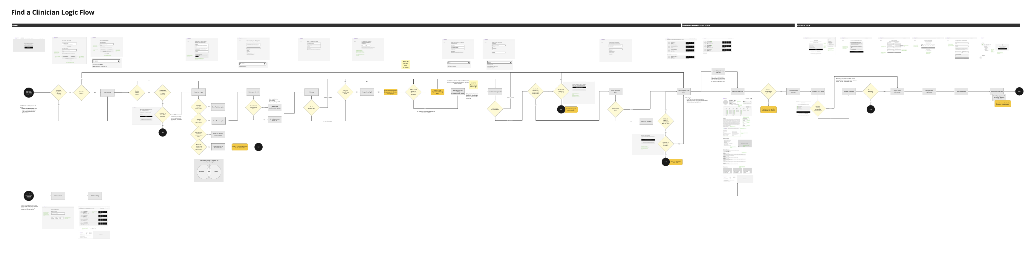
Logic Flow
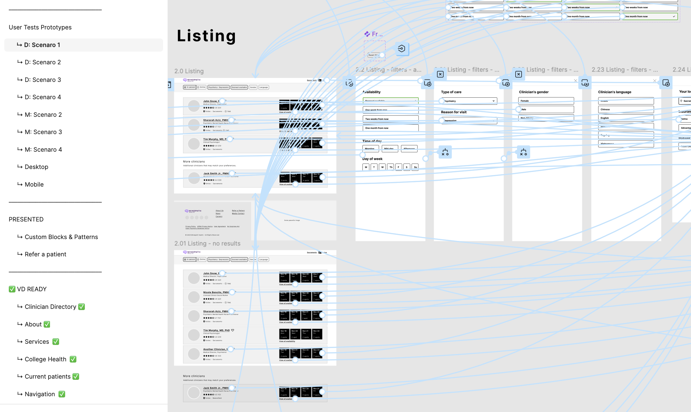
We’ve translated the learnings from the journey mapping work, our learnings of internal workflows, insurance nuances, and technology integrations to layout an extensive logic flow documenting user’s progressing through the website provider finder and scheduler. The large sections included:
- A screener questionnaire (that fed the filtering logic)
- Provider listing
- Provider profile & availability
- Patient-intake and scheduler
💡 User Insight
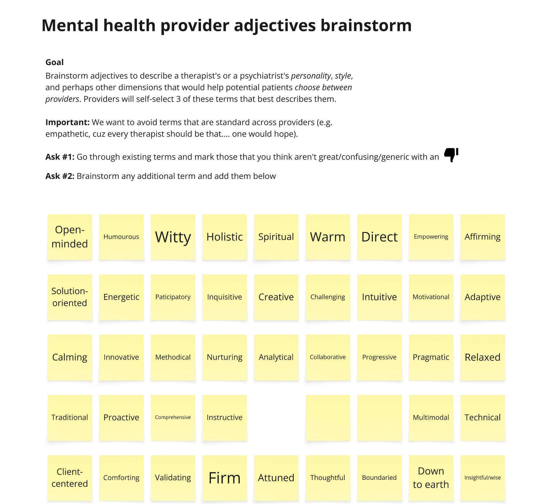
Even with filtration of conditions, availability, proximity (and others), in densely populated areas with many Mindpath offices, after the initial onboarding, the user was met with a wall of provider faces to choose from. And photo was pretty much all they’ve had to go off of to select a provider for further consideration.
How do we hep users distinguish the providers on this initial results screen? Since even psychiatrists engaged in therapy, I had an idea to indicate their therapy “style.” I’ve recruited colleagues who have engaged in mental health services to brainstorm descriptors and then synthesized them a smaller list of adjectives.
Early prototype testing
We did extensive early testing of the entire user flow, divided into 4 scenarios, testing key flows:
- The happy path: general flow with no side quests
- Long path: when the user skips insurance selection and realizes that the selected provider is out of network
- TMS path: users who are interested in Transcranial Magnetic Stimulation
- College Health path: a path specific to college students who came to the site via a referral