Nicolas Knight
Dashboard
Data Storytelling
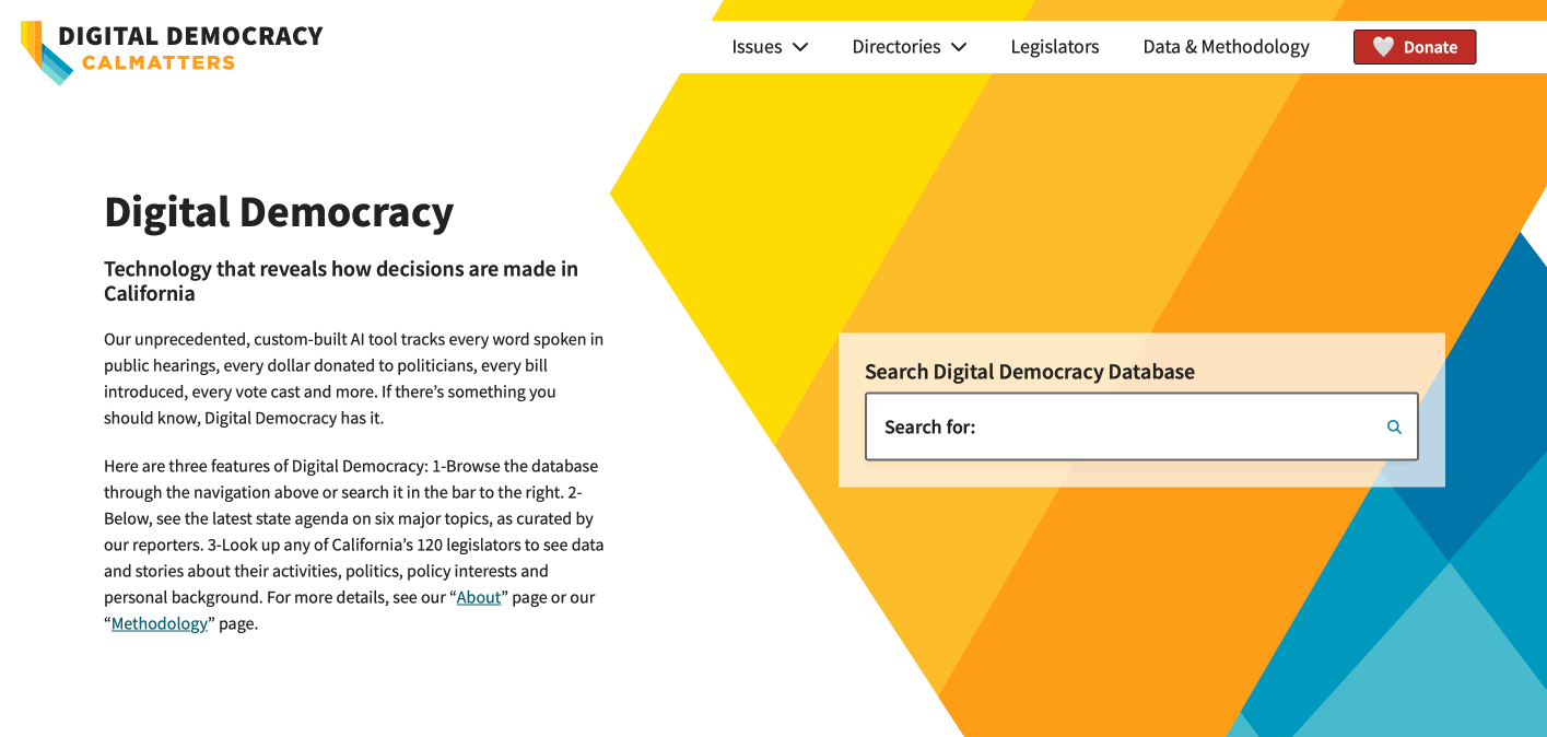
Digital Democracy
Summary
Every vote, campaign contribution, behest and gift made to a legislator, every word spoken during a hearing, and every bill amendment and redaction is tracked. There are money breadcrumbs and unexpected influences that reveal our representatives’ true colors. Problem was, this data is largely inaccessible to anyone who is not a reporter or lacks political know-how to make sense of all this data (i.e. most of us).
The goals for this project were:
- Use the deep government data to tell meaningful data stories that an average citizen can find interesting and insightful.
- Create research tools for deeper investigation into never-before possible relationships, transactions, and potential stories.
Project: Digital Democracy
Client: CalMatters
Platform: WordPress
Role: UX Lead
Activities:
- Scope planning
- Discovery workshops
- Research
- Data storytelling & visualization
- Prototyping
- User testing
🏆 Accolades
Soon after launching, Digital Democracy was featured in a CBS investigative story.
Digital Democracy website and CBS News collaboration won Emmy award, honoring accountability journalism that, as one reporter described, “I could not have done” without Digital Democracy.
Discovery & Scope Planning
The client had a vision that included several interconnected products, a vision that we’ve helped them refine over several workshops:
- Digital Democracy - CA legislation for dummies: A curated, condensed guide to help voters get to know their 120 legislators to help them with their voting decision
- Tip Sheets: Summaries of legislative hearings. Tool to help reporters find ideas for their stories based on recent legislative hearings
- Search: A way to explore a vast ocean of legislative data. Comprehensive research tool for those interested in deeper investigation (think query builder).
Conceptual Models & Foundational Architecture
Visual diagrams help frame discussions. One model that was useful is a spoon<->bucket spectrum, symbolizing the depth of legislative information the different products made available to the user.
This led to the idea of Digital Democracy’s primary pages catering to general voters with highly curated (i.e. spoon fed) content with ability for deeper dives into the database (i.e. U-pick bucket to do your own research), while Tip Sheets become a separate gated product for beat reporters.
Audience research
The budget for any external research was mostly nonexistent, so we’ve worked with what we had, and what we had was an easy access to reporters. We ran interviews and held audience discovery workshops with the client and compiled the findings in several user profile sheets.
Stories & Feature Prioritization
We’ve used the insights from the interview with reporters along with client’s list of feature ideas to put together a comprehensive table of user stories, and ran several prioritization and brainstorming workshops to narrow in the current scope and budget.
Data Storytelling
Content Ecosystem Mapping
With literally hundreds of data points available to pull from, the question of what data is relevant to which user and what data stories we want to tell them became our driving inquiry and instigated the need to understand the larger picture of state legislature.
One exercise that helped was a collaborative ecosystem workshops to map out the relevant data entities available to us for storytelling. It was messy, but it helped us understand the relationships between legislature, people, and organizations, and how money and influence flowed within the political ecosystem.
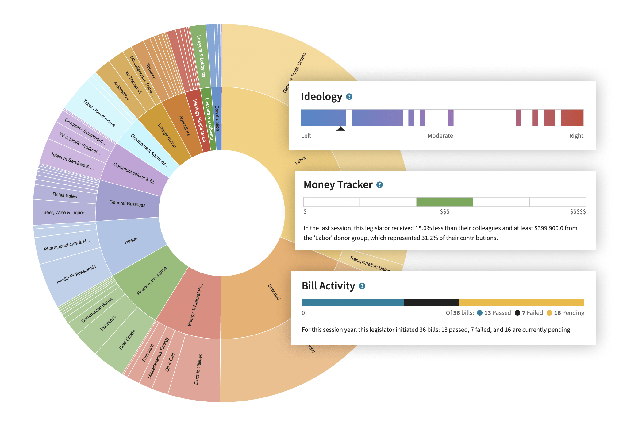
“A really large baseball card”
The MVP players in state government are the legislators, and so much of the political activity revolves around them. We wanted to create a homepage (a.k.a. baseball card) of each legislator that brought high-value, easy-to-understand information to general voters.
Examples of techniques we’ve used:
- We used meters to show legislator’s real ideology (based on their voting patterns), how active/sedentary their political activity was (based on hearing attendance, committee membership, bill initiation, etc.), and money tracker indicating how much money they attracted.
- We’ve assigned leader badges to identify major topic influencers
- Alignment rankings showed idealogical alignment with organizations from different sectors.
💡 User Insight
We’ve put a leaderboard feature on the homepage as a discovery tool for general voters. What we didn’t intend is that legislators themselves started using them for friendly competitions.
One legislator even brought it up during a public hearing!
A smattering of rabbit holes
Building on our spoon/bucket analogy, beyond being well-informing, we wanted our baseball cards to act as springboards into various rabbit holes for deeper investigation. With our flows, you could follow the money trail or virtually stalk a legislator until you stumble across fascinating insights (like the CBS story).
One progressive disclosure technique we’ve used to accomplish this are the various side modals that allowed users to glean deeper levels of information and provide signposts to the deepest-level search and entity detail pages.
More Storytelling Concepts
Screens
Nicolas Knight
Dashboard
Data Storytelling
Digital Democracy
Summary
Every vote, campaign contribution, behest and gift made to a legislator, every word spoken during a hearing, and every bill amendment and redaction is tracked. There are money breadcrumbs and unexpected influences that reveal our representatives’ true colors. Problem was, this data is largely inaccessible to anyone who is not a reporter or lacks political know-how to make sense of all this data (i.e. most of us).
The goals for this project were:
- Use the deep government data to tell meaningful data stories that an average citizen can find interesting and insightful.
- Create research tools for deeper investigation into never-before possible relationships, transactions, and potential stories.
Project: Digital Democracy
Client: CalMatters
Platform: WordPress
Role: UX Lead
Activities:
- Scope planning
- Discovery workshops
- Research
- Data storytelling & visualization
- Prototyping
- User testing
🏆 Accolades
Soon after launching, Digital Democracy was featured in a CBS investigative story.
Digital Democracy website and CBS News collaboration won Emmy award, honoring accountability journalism that, as one reporter described, “I could not have done” without Digital Democracy.
Discovery & Scope Planning
The client had a vision that included several interconnected products, a vision that we’ve helped them refine over several workshops:
- Digital Democracy - CA legislation for dummies: A curated, condensed guide to help voters get to know their 120 legislators to help them with their voting decision
- Tip Sheets: Summaries of legislative hearings. Tool to help reporters find ideas for their stories based on recent legislative hearings
- Search: A way to explore a vast ocean of legislative data. Comprehensive research tool for those interested in deeper investigation (think query builder).
Conceptual Models & Foundational Architecture
Visual diagrams help frame discussions. One model that was useful is a spoon<->bucket spectrum, symbolizing the depth of legislative information the different products made available to the user.
This led to the idea of Digital Democracy’s primary pages catering to general voters with highly curated (i.e. spoon fed) content with ability for deeper dives into the database (i.e. U-pick bucket to do your own research), while Tip Sheets become a separate gated product for beat reporters.
Audience research
The budget for any external research was mostly nonexistent, so we’ve worked with what we had, and what we had was an easy access to reporters. We ran interviews and held audience discovery workshops with the client and compiled the findings in several user profile sheets.
Stories & Feature Prioritization
We’ve used the insights from the interview with reporters along with client’s list of feature ideas to put together a comprehensive table of user stories, and ran several prioritization and brainstorming workshops to narrow in the current scope and budget.
Data Storytelling
Content Ecosystem Mapping
With literally hundreds of data points available to pull from, the question of what data is relevant to which user and what data stories we want to tell them became our driving inquiry and instigated the need to understand the larger picture of state legislature.
One exercise that helped was a collaborative ecosystem workshops to map out the relevant data entities available to us for storytelling. It was messy, but it helped us understand the relationships between legislature, people, and organizations, and how money and influence flowed within the political ecosystem.
“A really large baseball card”
The MVP players in state government are the legislators, and so much of the political activity revolves around them. We wanted to create a homepage (a.k.a. baseball card) of each legislator that brought high-value, easy-to-understand information to general voters.
Examples of techniques we’ve used:
- We used meters to show legislator’s real ideology (based on their voting patterns), how active/sedentary their political activity was (based on hearing attendance, committee membership, bill initiation, etc.), and money tracker indicating how much money they attracted.
- We’ve assigned leader badges to identify major topic influencers
- Alignment rankings showed idealogical alignment with organizations from different sectors.
💡 User Insight
We’ve put a leaderboard feature on the homepage as a discovery tool for general voters. What we didn’t intend is that legislators themselves started using them for friendly competitions.
One legislator even brought it up during a public hearing!
A smattering of rabbit holes
Building on our spoon/bucket analogy, beyond being well-informing, we wanted our baseball cards to act as springboards into various rabbit holes for deeper investigation. With our flows, you could follow the money trail or virtually stalk a legislator until you stumble across fascinating insights (like the CBS story).
One progressive disclosure technique we’ve used to accomplish this are the various side modals that allowed users to glean deeper levels of information and provide signposts to the deepest-level search and entity detail pages.
More Storytelling Concepts
Screens