Nicolas Knight
Dashboard
Information Architecture
CA Department of Healthcare Redesign
Summary
100+ departments and division, 30 years of content, 50K pages and PDFs... overgrown government websites can be frightening things even for a team of seasoned UX and content designers to tackle. DHCS was the most complex IA project I’ve ever tackled, involving mind-numbing content spelunking, complex content ecosystem, and a persistent uncertainty about which user needs the site should prioritize.
Client: California Depart of Health Care Services
Role: UX Lead
Activities:
- Discovery workshops
- Research & testing
- Content spelunking
- Analytics analysis
- Information architecture
IA without AI
Due to stringent security mandates, we couldn’t leverage AI tools to helps us structure and categorize content and taxonoies, which made the challenge even more formidable.
Content ecosystem to the rescue
This was the 2nd time I’ve utilized this wonderful visualization technique to understand a complex domain.
Easy tree testing
Top tasks and a multi-level IA is a wonderful preconditions for a tree test... pretty much plug and play.
Discovery
Planning
Government projects often come with a highly prescriptive SOW and a range of deliverables we’re mandated to complete, which can make it difficult to pivot when a better approach comes up. I’ve led collaborative planning sessions with the internal team to strategize critical pathing to achieve this goals.
Discovery workshops
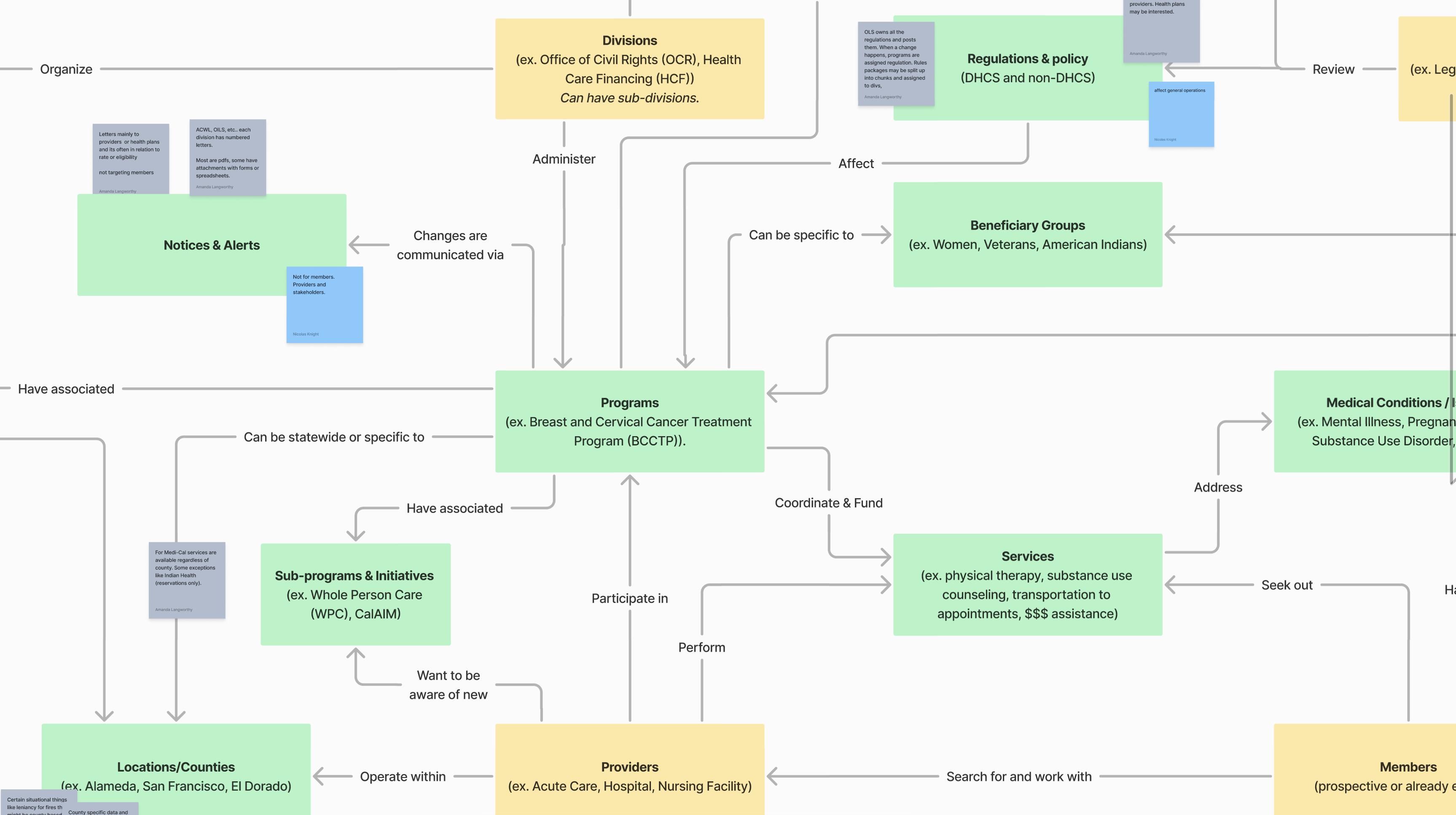
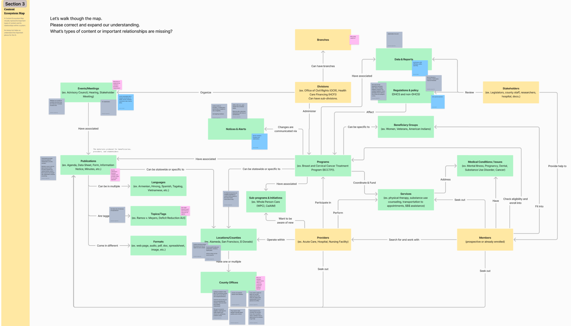
I’ve designed a series of workshops to help us understand the complex organizational structure of DHCS and the layers of content these departments are responsible for producing. My go to is the content ecosystem map, which reveals the relationships and purpose of different content pieces.
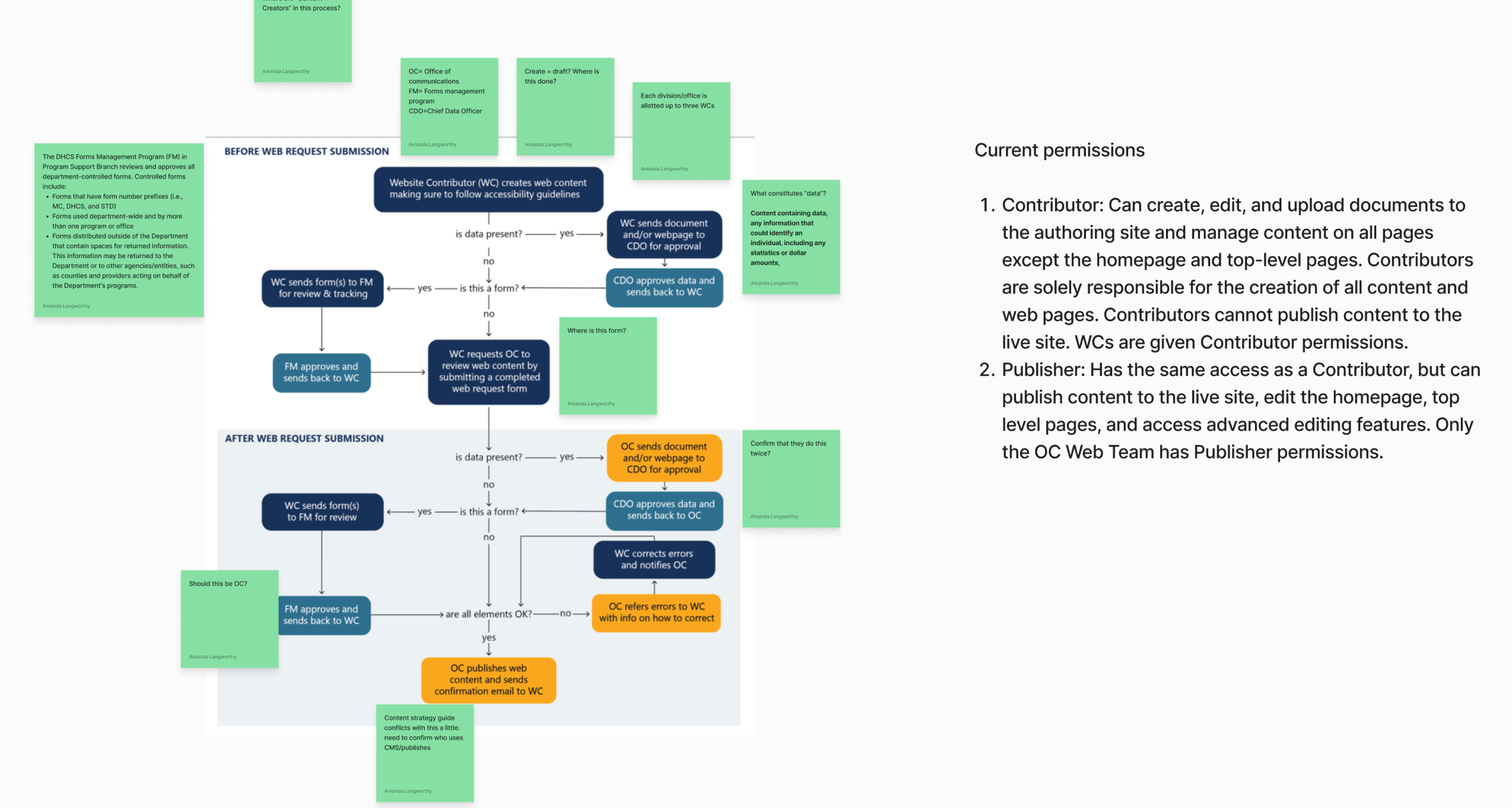
It’s also prudent to start thinking about publishing workflows as we’re exploring content types and content model.
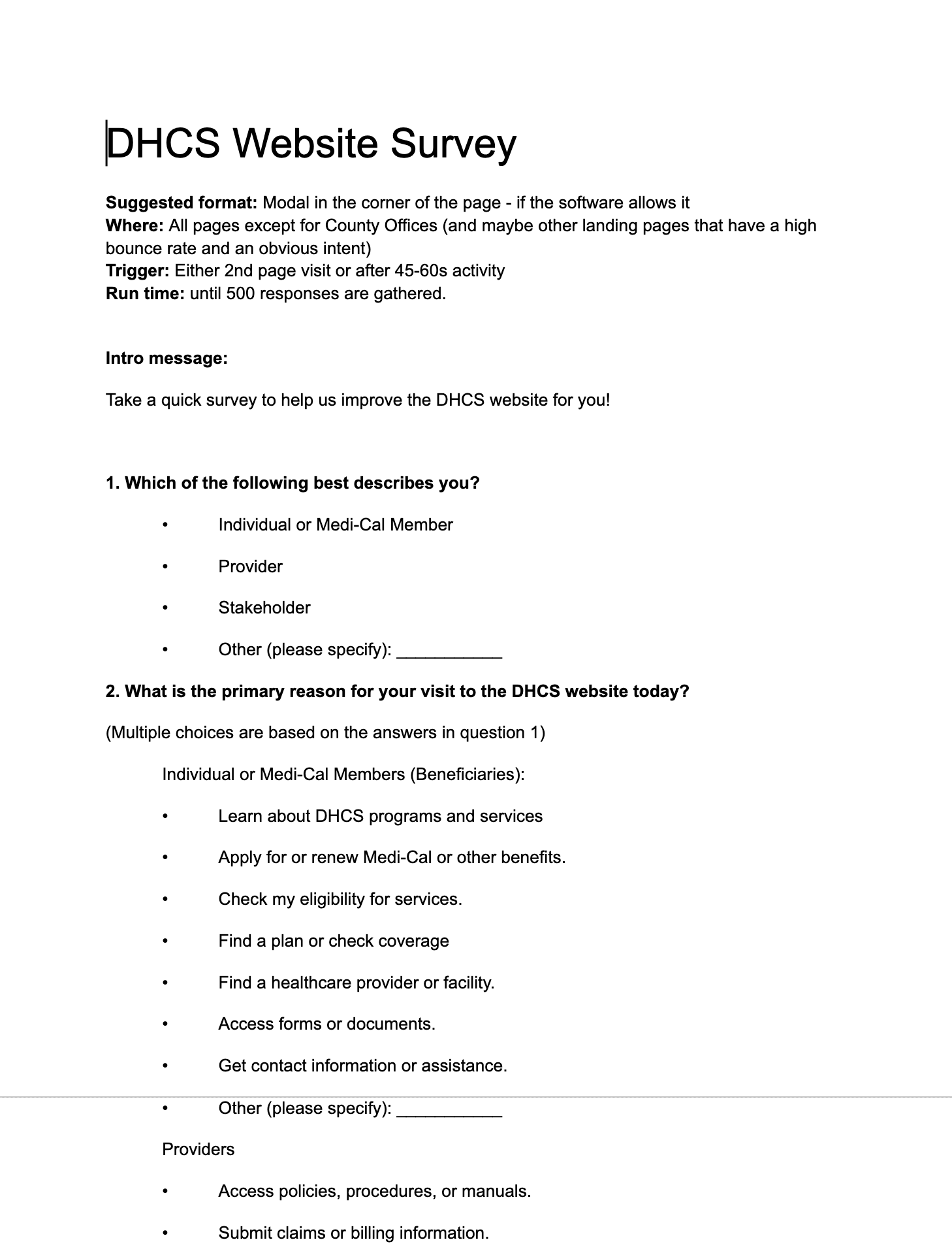
💡 Why do you come to the site?
The overabundance of continue and diverse audience groups, the client didn’t have a good sense of what the various users come to the site for, so our initial top tasks were hazy at best. We’ve looked at analytics for the most trafficked pages, and then asked users directly with an interceptor survey utilizing that data for structured responses.
Internal Department Survey
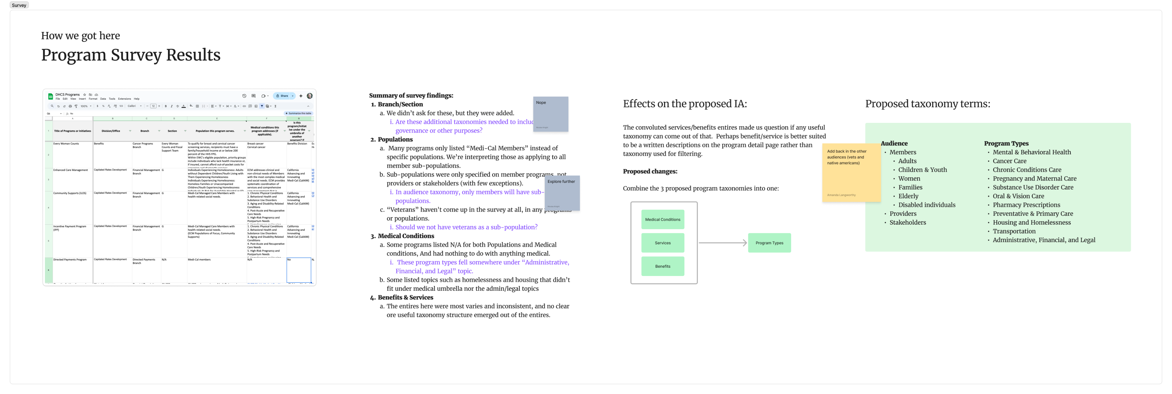
We’ve attempted to build the source of truth for all of the program and services that DHCS offered to the public. We’ve built an internal survey for departments and recruited the department heads to be responsible for filling it out. While the results were rather inconsistent despite our best attempts to get to a consistent answers across departments, we’ve learned enough to built out a taxonomy driven by audience types and service categories.
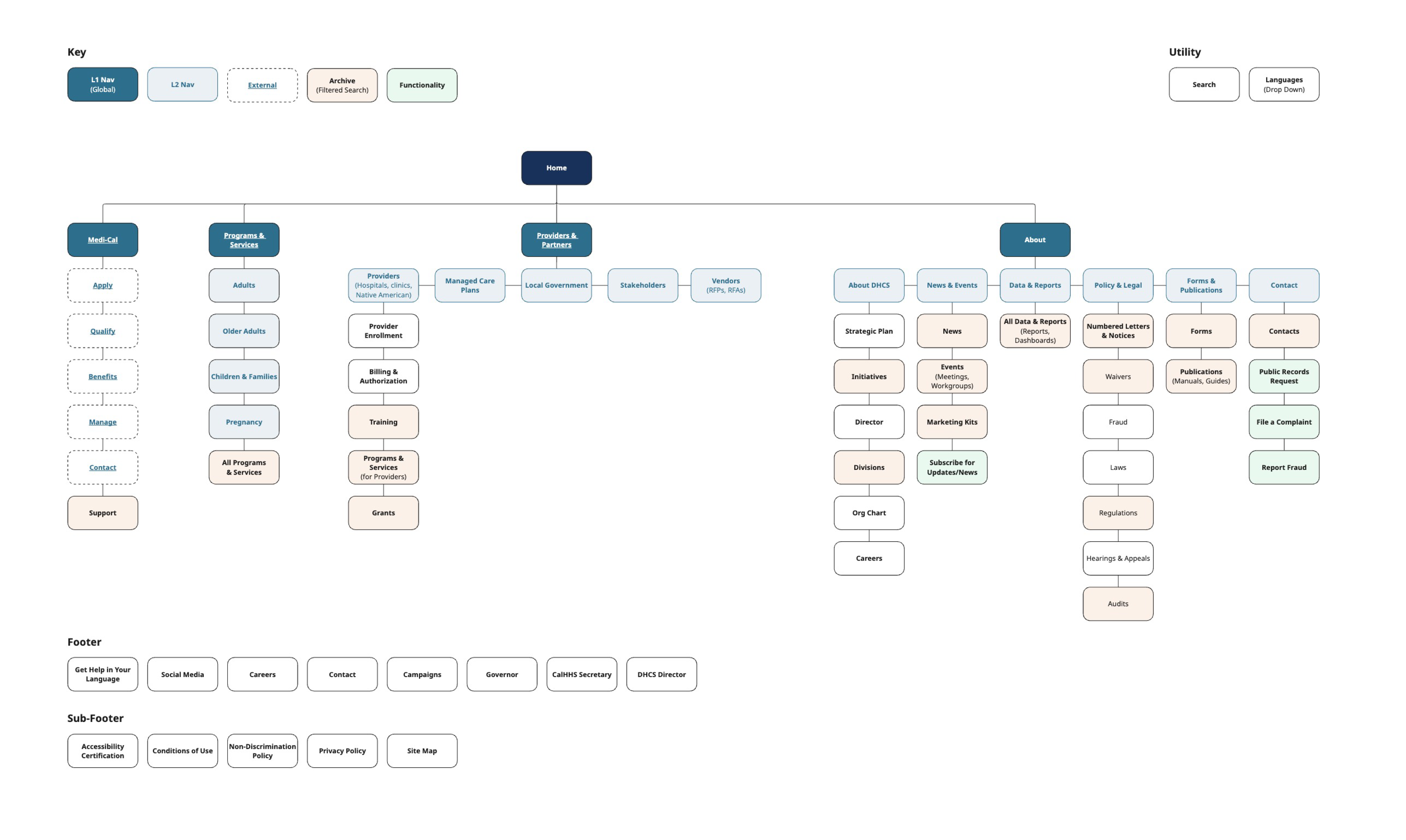
Information Architecture
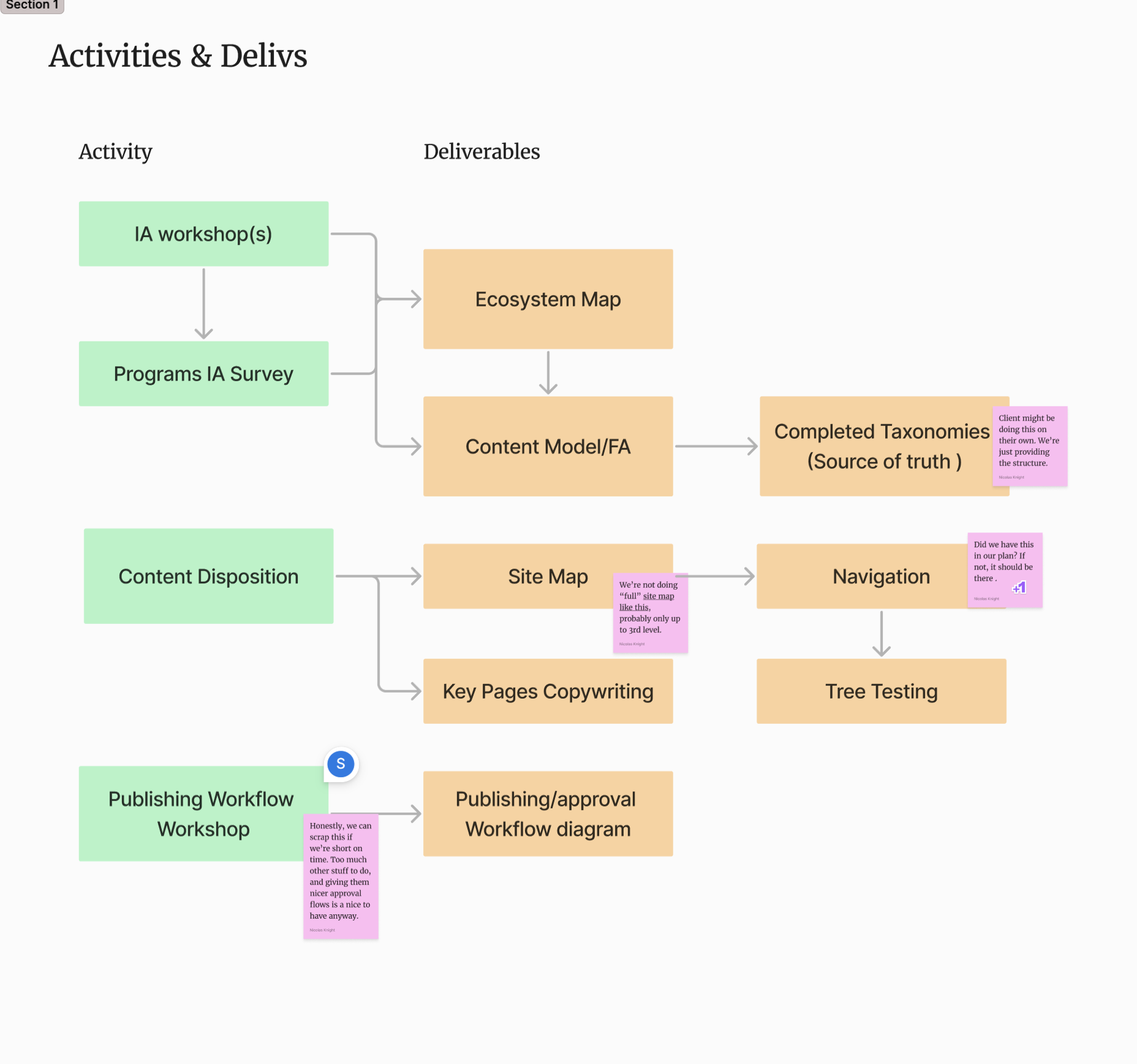
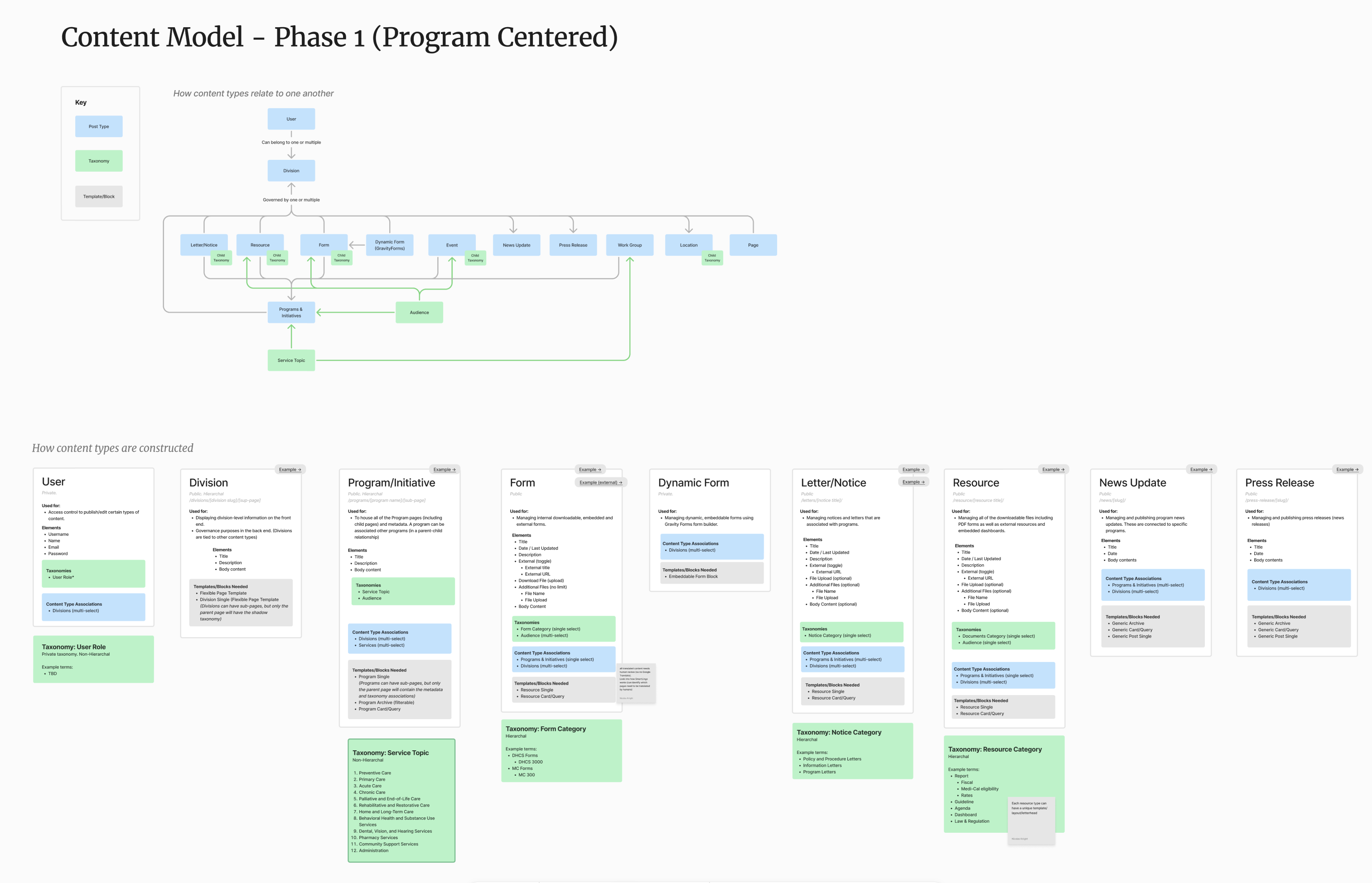
Following the WP content architecture and our findings from the content ecosystem, I’ve create a content model that shows the relationships of content types and also content structures. My process is similar to OOUX (object oriented UX), starting with a higher level content relationship map, and end with a granular level of meta data.
Content model should always come before the site map.
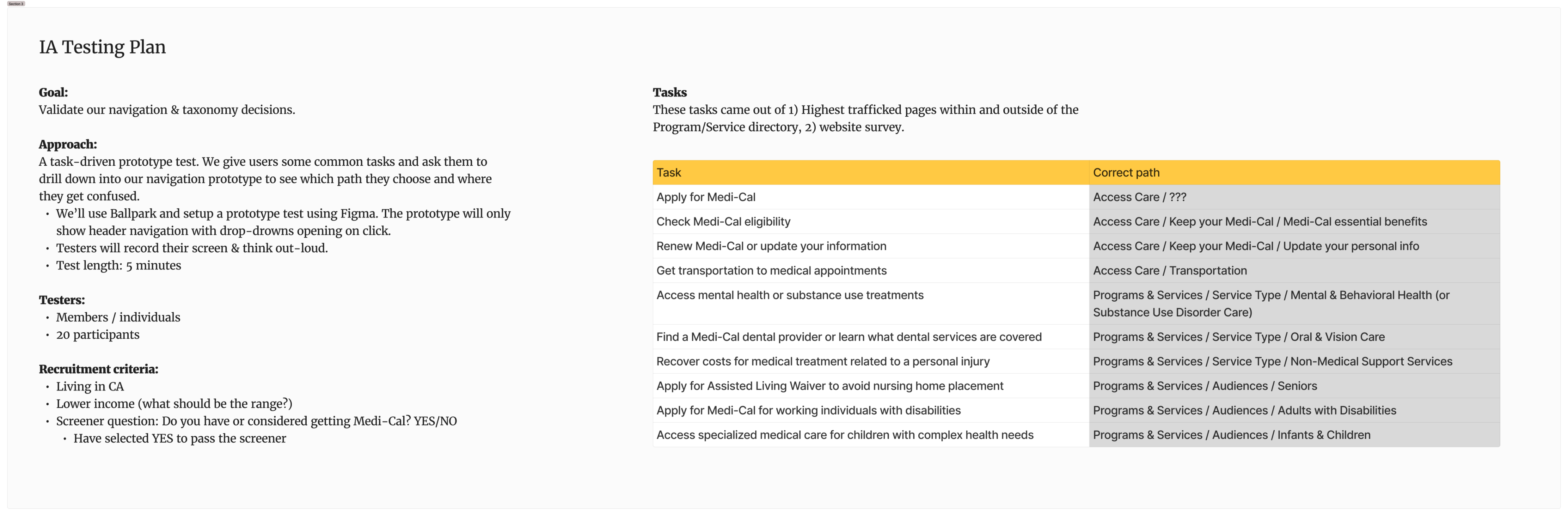
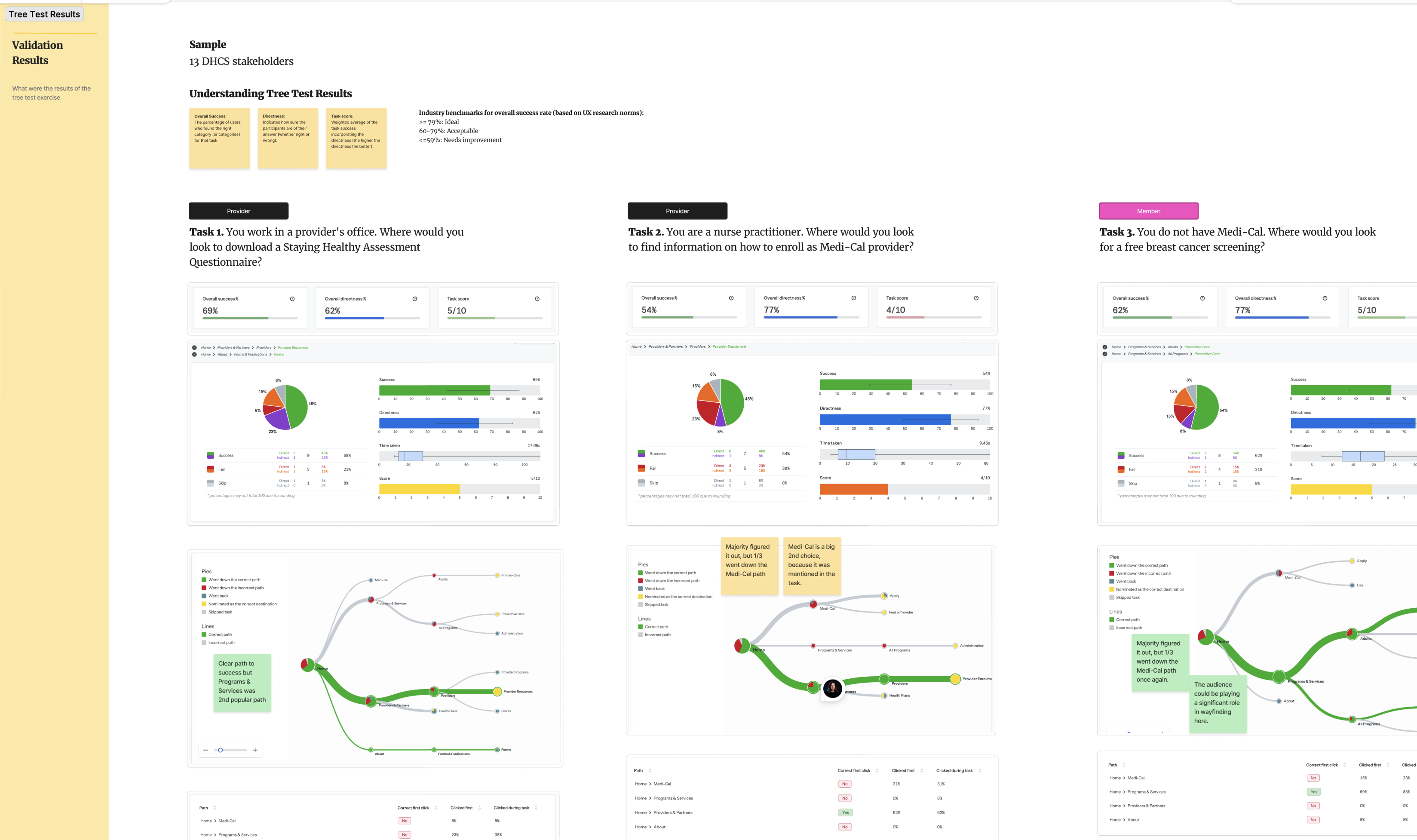
Testing
This project was perfect candidate for tree testing, as we’ve already have our top tasks and our sitemap paths for those tasks. OptimalWorkshop mains the king for running tree tests (although the quality of their tester pool leave much to be desired). We’ve uncovered some pitfalls in our navigation labels and taxonomy terms and iterated from there.
Nicolas Knight
Dashboard
Information Architecture
CA Department of Healthcare Redesign
Summary
100+ departments and division, 30 years of content, 50K pages and PDFs... overgrown government websites can be frightening things even for a team of seasoned UX and content designers to tackle. DHCS was the most complex IA project I’ve ever tackled, involving mind-numbing content spelunking, complex content ecosystem, and a persistent uncertainty about which user needs the site should prioritize.
Client: California Depart of Health Care Services
Role: UX Lead
Activities:
- Discovery workshops
- Research & testing
- Content spelunking
- Analytics analysis
- Information architecture
IA without AI
Due to stringent security mandates, we couldn’t leverage AI tools to helps us structure and categorize content and taxonoies, which made the challenge even more formidable.
Content ecosystem to the rescue
This was the 2nd time I’ve utilized this wonderful visualization technique to understand a complex domain.
Easy tree testing
Top tasks and a multi-level IA is a wonderful preconditions for a tree test... pretty much plug and play.
Discovery
Planning
Government projects often come with a highly prescriptive SOW and a range of deliverables we’re mandated to complete, which can make it difficult to pivot when a better approach comes up. I’ve led collaborative planning sessions with the internal team to strategize critical pathing to achieve this goals.
Discovery workshops
I’ve designed a series of workshops to help us understand the complex organizational structure of DHCS and the layers of content these departments are responsible for producing. My go to is the content ecosystem map, which reveals the relationships and purpose of different content pieces.
It’s also prudent to start thinking about publishing workflows as we’re exploring content types and content model.
💡 Why do you come to the site?
The overabundance of continue and diverse audience groups, the client didn’t have a good sense of what the various users come to the site for, so our initial top tasks were hazy at best. We’ve looked at analytics for the most trafficked pages, and then asked users directly with an interceptor survey utilizing that data for structured responses.
Internal Department Survey
We’ve attempted to build the source of truth for all of the program and services that DHCS offered to the public. We’ve built an internal survey for departments and recruited the department heads to be responsible for filling it out. While the results were rather inconsistent despite our best attempts to get to a consistent answers across departments, we’ve learned enough to built out a taxonomy driven by audience types and service categories.
Information Architecture
Following the WP content architecture and our findings from the content ecosystem, I’ve create a content model that shows the relationships of content types and also content structures. My process is similar to OOUX (object oriented UX), starting with a higher level content relationship map, and end with a granular level of meta data.
Content model should always come before the site map.
Testing
This project was perfect candidate for tree testing, as we’ve already have our top tasks and our sitemap paths for those tasks. OptimalWorkshop mains the king for running tree tests (although the quality of their tester pool leave much to be desired). We’ve uncovered some pitfalls in our navigation labels and taxonomy terms and iterated from there.